

Introduction
It’s time to return to the original goal: visually sorting my colors in a way that’s both pleasing and meaningful. Here’s a quick recap of what we’ve done so far. In my first post, I explained the HSV color model and how to plot it—comparing the cylindrical representation to a linear HSV plot. We analyzed the data using histograms and a statistical technique called K-Means clustering. While this provided valuable insights, it didn’t directly help me achieve my sorting goal.
In my second article, I explored whether my current color palette was sufficient or needed updating. I used a Rembrandt painting as inspiration and again applied K-Means clustering to approach the problem. I concluded that, if I were to expand my collection, the most useful additions would be a sky blue and/or a dark yellow.
While writing that article, I kept thinking about how to develop a sorting algorithm that does exactly what I need. I had already hinted at the idea of using machine learning to help. That is where this article continues with. I hope that after reading this article, you’ll feel inspired to explore how machine learning could support your own projects and creative decisions.
Table of Contents
In this post, I’ll illustrate how I extracted the colors of my paints using three different methods. One set of paints is used for developing and testing the sorting approach, while another is used to check for repeatability and consistency of the sorting algorithms.
To tackle the challenge of color sorting, I explore two distinct approaches—one rooted in statistical analysis, and the other in machine learning. The first approach uses a statistical technique called Principal Component Analysis (PCA), which reduces the dimensionality of the HSV color model to simplify sorting based on the most significant variation in color. For the second approach I use a powerful machine learning method known as XGBRanker, a gradient boosting algorithm that has gained popularity worldwide for solving ranking problems like this one [1][2].
By comparing these two strategies—PCA for its interpretability and simplicity, and XGBRanker for its adaptability and predictive strength—I aim to find a solution for my sorting problem
Paint data & Color Extraction Methods
What I hadn’t shown so far in any of my previous posts is the actual dataset of colors used in this project. For the Vallejo Model Color paints (70.XXX series), I tracked down two different sources online to get accurate color representations, plus one that I did myself.
The first source was a spreadsheet created by Frenzycheck. Although it was incomplete, the spreadsheet included colored cells for many paints, so I used the color picker tool in MS Paint to extract approximate hex codes from those cells. The second source was Encycolorpedia.com, which provided hex codes for every color I own. Finally, the third method involved manually picking colors directly from a photo of my paint bottles. Of course, this photo-based approach is influenced by factors such as lighting conditions, shadows, camera white balance, and the white primer, all of which can subtly shift the perceived colors.

In Figure 1, I present a side-by-side comparison of the colors from the three different sources, with each row corresponding to the same paint bottle. This comparison highlights some noticeable differences: colors from Encycolorpedia.com appear darker, while those extracted from my own photograph are generally brighter—possibly more representative of how the paints actually look in real life when applied over a white primer. The image I used for color extraction is shown further down on this page in Figure 3.
In my previous two posts, I used the Encycolorpedia color set for all analyses and sorting, and I will continue to do so unless stated otherwise. I chose this dataset because it appears unaffected by primer or other external factors, offering a more neutral baseline. While these colors tend to be darker than what I observe on my actual paint rack, they provide a consistent starting point.
Approach 1: Principle Component Analysis
In my first article on this topic, I explored a basic Hue vs. Saturation plot—but this completely ignored the brightness (Value) component, limiting its usefulness. Nonethless, a 2D representation would make visual comparison easier, but there is always the risk of losing important information, when reducing three dimensions (Hue, Saturation, and Value) down to two dimensions.
From statistics and signal processing, we know that certain techniques exist that can help us. Principal Component Analysis (PCA) is such a technique, that is used to reduce the dimensionality of a dataset while preserving as much of its variation (information) as possible. When datasets have several features, PCA identifies the directions (called principal components) along which the data varies most. It then projects the data into a lower-dimensional space aligned with those directions, making it easier to analyze or visualize [3].
In this case, I apply PCA to project the 3D HSV dataset into a 2D space. Imagine the data points—each representing a color in HSV—as forming a lumpy, potato-shaped cloud in 3D. PCA looks for the longest axis through this cloud, which is the direction where the data varies the most. This is called the first principal component (PC1). It captures the most structure in the dataset. The second principal component (PC2) is the next-best axis, perpendicular to the first, capturing the next most variation. By projecting the entire cloud onto this 2D plane defined by PC1 and PC2, we flatten the shape in the most informative way possible—often preserving over 90% of the total variance. This means we can visualize our 3D color space in 2D while still keeping most of the meaningful differences between colors.
					from sklearn.decomposition import PCA

# hsv_features is a (n_colors x 3) array
pca = PCA(n_components=2)
hsv_2d = pca.fit_transform(hsv_features)
Without knowing much on the exact mathematical theorems, implementing PCA in Python is straightforward, as shown in the code above. The resulting variable hsv_2d is now a 2D projection of the original 3D HSV color data, making it ideal for visualization, which is shown in Figure 2. This 2D representation retains 81.7% of the total variance from the original dataset—meaning that most of the essential color relationships are preserved despite the dimensionality reduction.
Visualization of the dimensionality reduction.
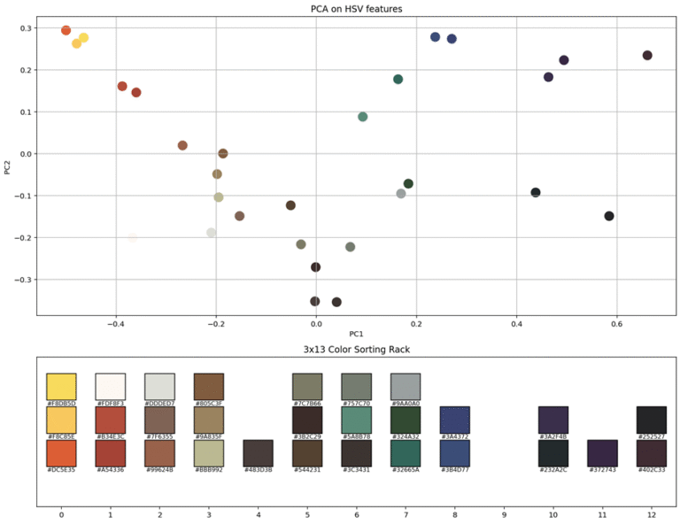
Now that we have a 2D plot, the next step is to find a way to sort the colors. I realized afterward that we only need to consider the first principal component (PC1) and arrange the colors along this 1D ordering. Since the sorting rack is 3×13, it makes sense to group the colors in sets of three, following their position along the PC1 axis. As a side note, the explained variance by PC1 has now dropped to just above 60%.
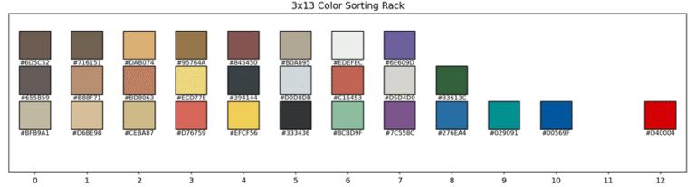
The 2D plot was still useful for identifying sparse regions where grouping colors into sets of three didn’t make much sense. The final arrangement is shown in the 3×13 color sorting rack in Figure 2 (bottom). I applied the same ordering to my own paint collection (except without the gap at position 9), and the result—shown in Figure 3—looks quite pleasing to me.

Repeatability Discussion
Up to this point, I’ve used the Encycolorpedia color set for all my analyses and sorting. However, after reviewing the initial sorting results, I want to repeat the process using the photo-extracted colors, since they may better capture the true colors of my paint bottles under typical lighting conditions. This could improve the accuracy and visual appeal of the color sorting rack. The same method was applied, and the result can be seen in Figure 4.
Unfortunately, this sorting turned out to be less visually pleasing than the earlier sorting. There are a few reasons for this. Firstly, the first principal component (PC1) in this case explained only about 51% of the variance in the HSV data—considerably less than the 60%+ achieved in the previous PCA result. Secondly, PC1 represents just a straight line through the multi-dimensional color space, and this “optimal” line may not align well with how we perceive or prefer to arrange colors visually.
Additionally, the nature of HSV color space introduces challenges: hue values wrap around at 0 and 360 degrees, so red—being near both ends—can end up on opposite sides of the PCA line. In this case, my primary red paint was pushed to the far end of the spectrum, disconnected from similar warm tones. This linear approach doesn’t account for the circular nature of hue, making it more difficult to achieve a coherent, intuitive color progression.
One way to increase the explained variance is by using a different color representation model, such as CIELAB (Lab), which is designed to be more perceptually uniform. Another approach would be to use nonlinear dimensionality reduction techniques like UMAP or t-SNE, which can better capture complex relationships in the data. However, instead of relying on these predefined methods, I plan to experiment with machine learning, that I can train based on my own visual preferences—allowing for a more personalized and potentially more satisfying color arrangement.
Machine Learning Approach - XGBRanker
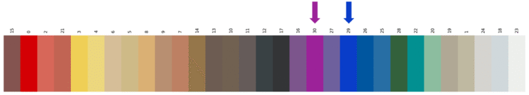
Ideally, I’d like to define the color scheme myself. The goal would be to have darker colors concentrated in the center, with warm tones—such as browns and yellows—gradually transitioning to the left, and cooler tones—like blues and whites—going toward the right. A great starting point for this concept is illustrated in Figure 5, which is sorted by myself.

For this problem, I used a machine learning model specifically designed to learn relative preferences: XGBRanker [4]. This model is well suited for my color ordering task, as it’s built for ranking problems—similar to deciding which search results should appear first.
Instead of providing absolute scores or full rankings for all colors, I only need to supply small subsets of colors, where I define the preferred order within each group. For example: “Color A should come before B, B before C”, and so on.
By feeding the model multiple such subsets where I defined my preferred color ordering, it learns to generalize the underlying structure of my preferences. It doesn’t just memorize the examples—it infers the visual and perceptual features (like hue, saturation, or brightness) that drive my choices. As a result, the model produced a global color order that aligns closely with how I intuitively want the colors to be arranged. In Figure 6 I show the result after 3, 6, 10 and finally 12 subsets of colors. After that moment I stopped as I believed I reached my goal.

By giving the model these subsets, it gradually learns which color features influence the ranking—such as hue, brightness, or saturation. If it sees enough diverse examples, it can infer that certain patterns matter: for instance, that hue direction (like red to yellow), darkness or brightness, or even warm vs cool tones influence the ordering.
This is what makes it a machine learning approach: I don’t explicitly tell the model what “rules” to follow. Instead, it discovers those rules from the data—by observing the relative relationships in the subsets I provide. As an example, I added in two new colors that it hasn’t seen before and it automatically added it to the right place. To fill my sorting rack, I just have to start stacking them in groups of 3. But one thing that I learned from PCA, is that it is okay to have groups of 2 or even 1 in there, if that makes the whole more visually pleasing.
Conclusion and Outlook
From the start of this mini-project, I suspected that machine learning would offer the most effective way to sort my colors. While it might seem like overkill (which is true in my case), that’s exactly why I first experimented with a more classical statistical technique, namely PCA. My initial results were promising, but when I applied the method to a slightly different set of colors, the outcome was less satisfying. As mentioned earlier, the HSV color model and the complexity of my paint set introduce several challenges, making perfect statistical alignment difficult.
Ultimately, I chose to use a machine learning approach. Unlike statistical techniques, machine learning algorithms can be trained on your personal preferences, allowing you to fine-tune results until you achieve an arrangement that truly matches your vision. I’ve found it to be an invaluable tool, and I encourage others to explore it for their own creative projects.
Possible future improvements could include using the CIELAB (Lab) color space—a more perceptually uniform model—but that would require significant changes to my code. Since my previous articles focused on the HSV model and its statistical analysis, I’ve kept my work consistent with that approach. However, if you’re interested in taking on this challenge, feel free to contact me. I’d be happy to share my Python code so you can adapt it to the CIELAB model.
References
[1] Makridakis, S., Spiliotis, E., & Assimakopoulos, V. (2022). M5 accuracy competition: Results, findings, and conclusions. International Journal of Forecasting, 38(4), 1346–1364. https://doi.org/10.1016/j.ijforecast.2021.11.013
[2] Januschowski, T., Wang, Y., Torkkola, K., Erkkilä, T., Hasson, H., & Gasthaus, J. (2022). Forecasting with trees. International Journal of Forecasting, 38(4), 1473–1481. https://doi.org/10.1016/j.ijforecast.2021.10.004
[3] Stats Stack Exchange. (n.d.). Making sense of principal component analysis (eigenvectors & eigenvalues). Retrieved June 2024, from https://stats.stackexchange.com/questions/ 2691/making-sense-of-principal-component-analysis-eigenvectors-eigenvalues
[4] XGBoost. (n.d.). Learning to Rank (LTR) with XGBoost. XGBoost Documentation. Retrieved June 2024, from https://xgboost.readthedocs.io/en/latest /tutorials/model.html
Florius
Hi, welcome to my website. I am writing about my previous studies, work & research related topics and other interests. I hope you enjoy reading it and that you learned something new.
More PostsYou may also like