© All rights reserved. Powered by Florisera.

RSS Daily tech news
  • This battery self-destructs: Biodegradable power inspired by 'Mission: Impossible'
    Scientists at Binghamton University are bringing a sci-fi fantasy to life by developing tiny batteries that vanish after use inspired by Mission: Impossible. Led by Professor Seokheun Choi, the team is tackling one of the trickiest parts of biodegradable electronics: the power source. Instead of using toxic materials, they re exploring probiotics friendly bacteria often […]
  • Scientists freeze quantum motion using ultrafast laser trick
    Harvard and PSI scientists have managed to freeze normally fleeting quantum states in time, creating a pathway to control them using pure electronic tricks and laser precision.
  • Researchers develop recyclable, healable electronics
    Electronics often get thrown away after use because recycling them requires extensive work for little payoff. Researchers have now found a way to change the game.
  • Ultra-thin lenses that make infrared light visible
    Physicists have developed a lens with 'magic' properties. Ultra-thin, it can transform infrared light into visible light by halving the wavelength of incident light.
  • Discovery could boost solid-state battery performance
    Researchers have discovered that the mixing of small particles between two solid electrolytes can generate an effect called a 'space charge layer,' an accumulation of electric charge at the interface between the two materials. The finding could aid the development of batteries with solid electrolytes, called solid-state batteries, for applications including mobile devices and electric […]
  • Engineers develop self-healing muscle for robots
    Students recently unveiled their invention of a robotic actuator -- the 'muscle' that converts energy into a robot's physical movement -- that has the ability to detect punctures or pressure, heal the injury and repair its damage-detecting 'skin.'

K-Means Clustering for Colors

by Florius

In my first post, I explored how to map my Vallejo Model Color paints onto an HSV color chart using a technique called K-Means clustering. That experiment got me thinking: could the same method be used to analyze figures and images with color schemes I like?

In this post, I’m shifting focus—not toward sorting my color palette, but toward evaluating it. Specifically, I want to see whether my current set of 28 Vallejo Model Color paints is complete, or if there are noticeable gaps that could be filled with additional colors.

Table of Contents

For this analysis, we’ll use an image of The Sampling Officials (De Staalmeesters), a painting by the renowned Dutch artist Rembrandt van Rijn, currently housed in the Rijksmuseum in Amsterdam. I’ll begin by explaining the concept of color quantization, a technique used to extract meaningful color data from an image. After that, I’ll apply the same methods to several other datasets.

image of The Sampling Officials (De Staalmeesters), a painting by the renowned Dutch artist Rembrandt van Rijn, currently housed in the Rijksmuseum in Amsterdam.
Fig 1. An image of The Sampling Officials (De Staalmeesters), a painting by the renowned Dutch artist Rembrandt van Rijn, currently housed in the Rijksmuseum in Amsterdam.

Color Quantization

An image (of a painting in this case) typically contains millions of pixels and often thousands of distinct RGB colors. Gradients in particular introduce many colors that are extremely similar but not identical, resulting in slightly different RGB—and therefore HSV—values. This makes it difficult to extract which colors he used by looking at the HSV plots. For instance, when we analyze the famous image of Rembrandt, the full HSV distribution with the million pixels (Figure 2, left) shows that nearly all colors fall within the red-orange hue range, spanning a wide range of saturation and value due to extensive blending. Some minor artifacts appear at other hue values, mostly at low saturation and brightness. These are likely shades of black, where the hue becomes unreliable due to insufficient brightness. Such points can be safely ignored in the analysis.

Fig. 2. (Left) 3D HSV distribution of all pixel colors in the image. (Right) 3D HSV distribution of colors after applying the K-Means clustering algorithm.
Fig. 2. (left) A 3D HSV distribution of all pixel colors. (right) A 3D HSV distribution after K-Means Clustering algorithm.

To get an idea of the colors Rembrandt used (and this is by no means true, but rather an approximation from my beginner model), we use the same technique as in my previous post, namely, K-Means Clustering.  

This algorithm starts by randomly placing k cluster centers. Then, for each pixel, it determines which cluster center it is closest to and assigns the pixel to that cluster. Once all pixels are assigned, the cluster centers are updated to be the average of the points assigned to them. This process repeats until the cluster centers stabilize.

Even though K-Means doesn’t explicitly track how often a color occurs, it implicitly accounts for color frequency because it processes every pixel in the image. If a particular color appears often, there will be many data points close to it, which pulls a cluster center toward that color during averaging. As a result, frequent colors have more influence on the final cluster centers than rare ones.

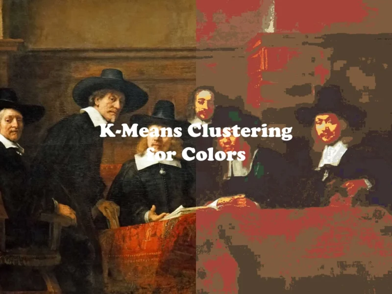
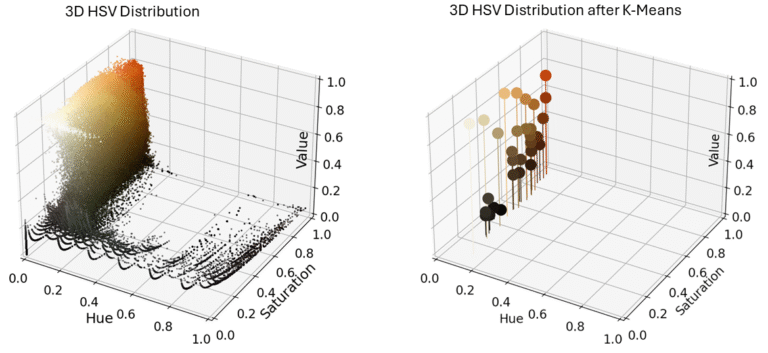
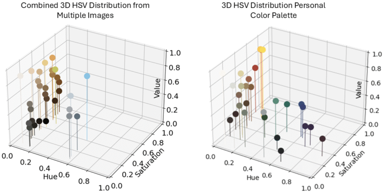
For this experiment, I chose to use 30 clusters, which roughly corresponds to the number of paint colors I have available. The resulting clusters are shown in Figure 2 (right), and as expected, they all fall within the red-orange hue range. Using these 30 representative colors, I then recolored the original painting by replacing each pixel with the color of its assigned cluster. The result is shown in the Figure below, where a slider allows you to compare the original image (left) with the recolored version (right).

image of The Sampling Officials (De Staalmeesters), a painting by the renowned Dutch artist Rembrandt van Rijn, currently housed in the Rijksmuseum in Amsterdam.

At first glance, the recolored image appears quite similar to the original. However, key details are noticeably lost: the bright red of the tablecloth, the subtle blue-gray tones of the hats, and the smooth gradient on the upper wall have all disappeared. While it’s possible that Rembrandt used 30 or fewer pigments in the original painting, they certainly weren’t the same 30 colors chosen by the clustering algorithm. His mastery lay in blending those limited pigments to create rich transitions and depth, whereas my approach assigns a single color to each pixel based on its cluster, leaving little room for nuance or gradient. Nonetheless, If I could to paint such an painting with 30 colors I would change my career.

Analyzing Multiple Datasets

A single image isn’t sufficient data to compare against my own color palette, so I decided to increase the sample size. I selected 10 images—ranging from objects and landscapes to game screenshots—as long as they reflected a color palette I liked and might consider painting (images are not shown here due to potential copyright). To ensure fairness (since some images, like those from my phone camera, had much higher resolutions), I resized each image to 200×200 pixels. This way, every image would contribute equally.

Next, I combined the resized images into one large composite image and applied the same clustering algorithm, extracting 30 color clusters. These representative colors are shown in Figure 3 (left). For comparison, Figure 3 (right) displays the colors I currently own.

Initially, I considered clustering each image individually and then clustering the resulting clusters. However, this approach would ignore the frequency of colors in each image. Combining all the images into one before clustering preserves this frequency information and yields a more meaningful comparison.

Fig. 3. (Left) 3D HSV distribution of multiple combined images after applying the K-Means clustering algorithm. (Right) 3D HSV distribution of my personal Vallejo Model Color paint palette.

The extracted colors from the clustering process are shown in Figure 4, along with their relative frequencies. Each color is labeled with its corresponding hexadecimal code. Overall, the palette shares some similarities with my own—particularly the prevalence of browns and warm, earthy tones, as well as a range of greys from light to dark.

Two colors stood out to me in particular, marked by arrows in the figure: #C5C564 and #8BC3E3. These hues—one a yellow-green blend and the other a soft baby blue—are reminiscent of Vallejo Model Color paints, specifically Dark Yellow (70.978) and Sky Blue (70.961). As it happened, last time I painted, I did need Sky Blue, and was actually mixing this color with my other blue and white.

Fig. 4. Bar chart showing the 30 colors extracted using K-Means clustering. The height of each bar represents the relative frequency of that color across the dataset. Hex color codes are shown above each bar.

Limitations of the Current Model

One of the main limitations of this clustering technique is that it tends to reduce overall brightness. In practice, you can darken a paint color by mixing it with black or desaturate it with white—but you can’t go the other way. In the extracted color palette, there are no truly bright or vivid tones. For example, I know I included a bright red and yellow in the dataset, which I had hoped would stand out, but it appears to have been muted. I suspect this is because the clustering algorithm averaged dominant darker and less saturated regions, pulling the entire palette toward more subdued tones.

Additionally, in Figure 4, the first 4 colors are variations of black, followed by 4 shades of gray, and then 4 dark browns. That means 12 out of the 30 recommended colors are essentially variations of neutral tones. In reality, I could represent all of those with just three paints.

Toward the middle and right of the figure, there are more interesting colors—ones I actually like and have something similar to in my collection, though not exact matches or in large quantities.

In summary, I’m not convinced this clustering model provided meaningful insight into what my palette is missing. It seems to overrepresent neutral tones and underrepresents the brighter colors I value.

Filtered Distribution

One of my main concerns was the overwhelming presence of black and other very low brightness or low saturation colors in the dataset. To address this, I implemented a filter to exclude pixels with saturation and brightness values below a chosen threshold. This way, only more vivid and visually relevant colors are considered, avoiding the dominance of dark, muted tones that can skew the palette.

All pixels

My initial test involved computing and visualizing the frequency of colors directly from the filtered pixel data, without any clustering. The results, shown in Figure 5, revealed that the brown gradients completely dominate the palette. Aside from a single blue hue, the color distribution lacks diversity and does not provide meaningful insight into which other colors might be missing or worth exploring.

Fig. 5. Bar chart showing the 30 colors extracted without using K-Means clustering, but just based on pixel data filtered to exclude colors with saturation and brightness below 0.2. The height of each bar represents the relative frequency of that color across the dataset. Hex color codes are displayed above each bar.
Fig. 5. Bar chart showing the 30 colors extracted without using K-Means clustering, but just based on pixel data filtered to exclude colors with saturation and brightness below 0.3. The height of each bar represents the relative frequency of that color across the dataset. Hex color codes are displayed above each bar.

Clustering

For the second test, I reintroduced K-Means clustering with the same saturation and brightness filter, set at a slightly stricter threshold of 0.3. This approach reduces the color complexity by identifying representative cluster centers. The results, displayed in Figure 6, reveal a more manageable palette with clearer dominant colors, including different shades of green, blue and red. In combination with the dark  earthy tones that were already present in all my previous tests as well.

Fig. 6. Bar chart showing the 30 colors extracted using K-Means clustering, filtered to exclude colors with saturation and brightness below 0.3. The height of each bar represents the relative frequency of each color across the dataset. Hex color codes are displayed above each bar.
Fig. 7. A 3D HSV distribution of multiple combined images after applying the K-Means clustering algorithm, filtered to exclude colors with saturation and brightness below 0.3.

Conclusion

From this analysis, it’s clear that a palette of around 30 colors is generally sufficient for a beginner to start painting—without needing to mix or blend colors extensively on the canvas or figurine. However, this only holds true if you have a clear idea of the color scheme or style you want to achieve.

The clustering model I used to identify these 30 key colors is not perfect; it comes with limitations and should be seen more as a guideline rather than a definitive solution. Ultimately, the palette it suggests represents a prediction or an informed estimate of the colors I might need in the future, based on my selected images. Because I already have 28 colors, I can do most, and probably would rather buy something whenever I come across a color I do not already own or can mix on a consistent basis, than to buy it on the whim of this analysis.

That said, this approach has practical value, especially for beginners who are unsure about which colors to start with. By uploading a set of 10 images that reflect your preferred color aesthetics, such a tool can generate a tailored list of the top 10 to 20 colors to build your initial palette. This personalized starting point could help reduce guesswork, simplify shopping, and accelerate the learning curve in painting.

Revisiting the Original Goal

My original goal was to find a way to organize my color palette in a visually pleasing and meaningful way. This article ended up becoming more of a side-quest—an exploration of which additional colors I might need, based on analyzing images that inspire me.

In a future article, I hope to return to the main objective: developing a method for sorting colors effectively. One idea I’m excited to explore is using machine learning (ML) to help with this. The plan is to provide the algorithm with a few curated examples of how I prefer my colors to be arranged, and let the machine do the thinking for me.

Florius

Hi, welcome to my website. I am writing about my previous studies, work & research related topics and other interests. I hope you enjoy reading it and that you learned something new.

More Posts

Leave a comment

This site uses Akismet to reduce spam. Learn how your comment data is processed.

Visual Portfolio, Posts & Image Gallery for WordPress